

Checkout our work

Parkar


Back
Back
Back
The results are in, the jury has spoken, and it's official: Tab navigation is better than the hamburger menu on mobile, for most cases. It's clear, gives you most options upfront and looks good. The next question now is, how do we design it effectively?
If we compare an app to a house, the tabs are the doors to different rooms. And just like how an architect knows how many rooms they want, an app designer should know how many navigation tabs they need. And you decide that from the Information Architecture (IA). If you don't create IA's, I suggest you start making them because this is where you put logically related elements together and create broader buckets. For example, the pantry logically belongs to the kitchen. So you give access to it via the kitchen. Similarly, in a shopping app, account settings, order history, manage profile, etc., should be clubbed into a single tab called 'Profile' rather than having separate ones for each.
Mobile screen space is prime real estate. And because it's limited, we should ideally have five or fewer tabs. It helps keep the cognitive load on the user in check and ensures that the tabs are not too close to be tapped comfortably.
Don't mix actions and navigational elements in the tab bar. You can include the primary action button of the app but nothing more, like how LinkedIn has the post button. The users expect to go to different sections of the app via the tabs, and mixing action buttons with navigation makes the system inconsistent.
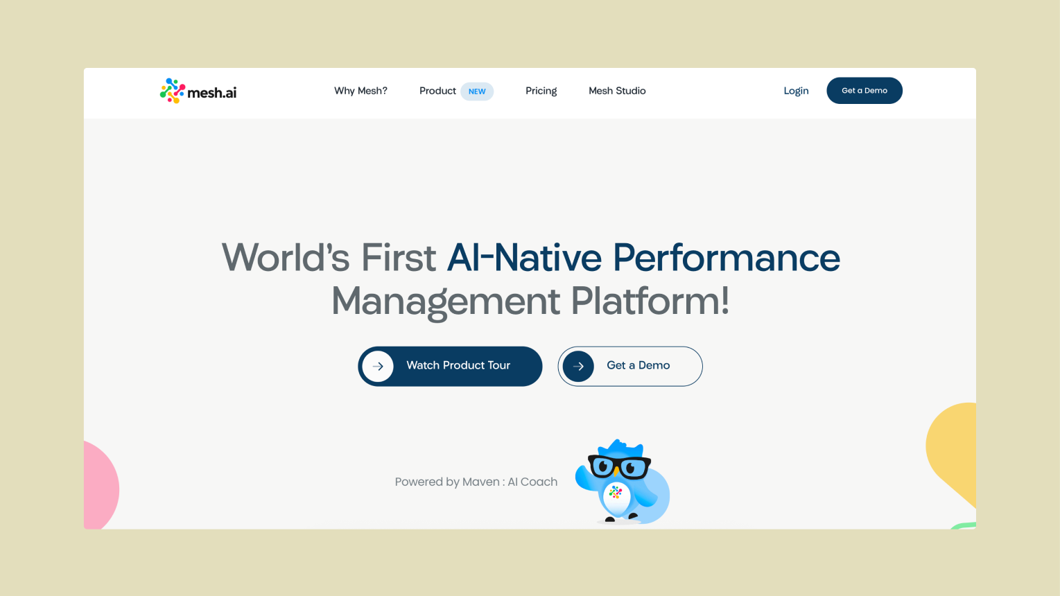
You have three options: 'icon only', 'label only', and 'icon and label'. You can choose among these depending on the visual style of the app. But for most cases, 'icon and label' is the best choice. The icons break the monotony of text and labels provide meaning to the icons.
Create meaningful and similarly styled icons, whether you go for line icons or filled ones. Even with line icons, ensure that the stroke width is consistent. Labels should be concise and have the same text styles.
The active state or the 'current tab' should be visually distinct from the other tabs. There are a few ways to achieve this:
Colour-blind people might find it hard to distinguish via colour changes. For greater accessibility, use other visual cues or combine two from the list above.
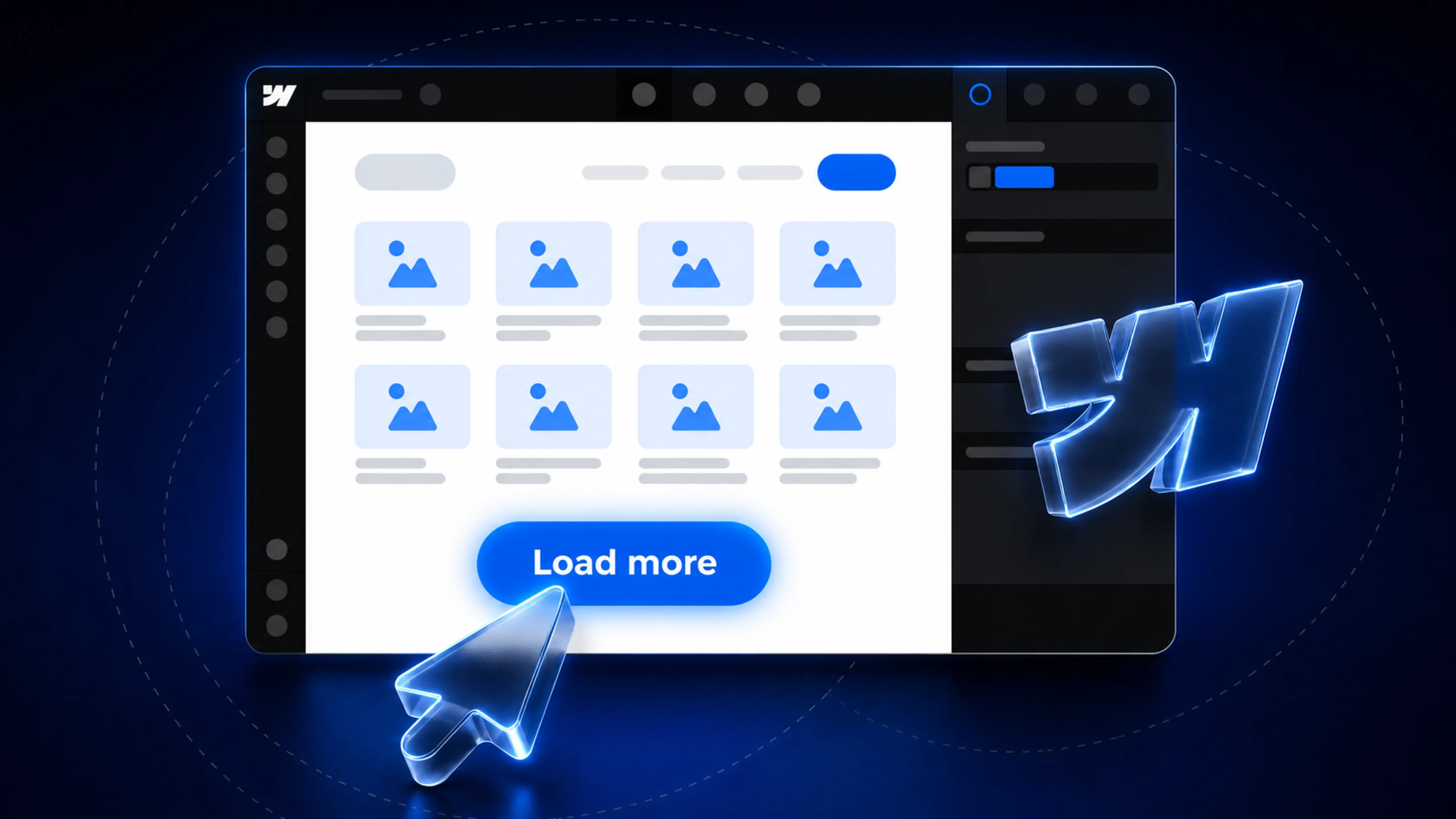
.webp)
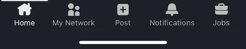
The first tab is the home or landing, which is the most used one. Arrange the rest in decreasing order of frequency of use.
If you have the main action in the tab bar, keep it in the centre for visual consistency.
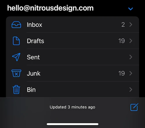
There's no one-size-fits-all solution for designing mobile navigation. There are cases where tab navigation is not even the best option, like the mail app on iOS. Since there are multiple mailboxes for each account and the users can add multiple accounts, there is no way to define a fixed tab structure. Even with Gmail on iOS, the tabs access different modules like mail, chat, groups and video calls and a hamburger menu has the mailboxes.
For most small and medium-sized applications, tab navigation works. And if you have decided to go with it, the tips in this article will help you.

The journey’s just as exciting as the destination. So, what are you waiting for? Let’s hit the gas.


