Checkout our work

Parkar


Back
Back
Back
If a prospect can’t understand what you do or where to click within five seconds, you’ve already lost them. The truth is, no amount of cold emails or LinkedIn messages can make up for a confusing website experience.
I audit B2B websites every week, and the pattern is painfully consistent: seven common leaks quietly drain conversions and demo bookings. These aren’t minor design flaws; they’re structural issues that stop great products from converting curious visitors into qualified leads.
In this breakdown, I’ll walk through each of those seven leaks from unclear positioning to weak CTAs and show you how to fix them. Because once your website starts working as hard as your SDRs, your pipeline will too.
Nothing kills interest faster than a slow-loading website. Every extra second your page takes to load increases the chance of users leaving and in the B2B world, no one waits for a spinning loader.
Compress visuals and optimize media to maintain quality without affecting performance. Use caching, lazy loading, and a global content delivery network (CDN). Test your website regularly to ensure it runs as efficiently as your business promises.
A fast site doesn’t just improve user experience; it signals reliability, boosts SEO rankings, and creates a strong first impression.
Check out our Regology case study, where we optimized the website to achieve an impressive load time of just 0.7 seconds.
Overcomplicated menus or creative layouts might seem innovative, but they often frustrate visitors who just want answers. When people struggle to find information, they leave. No matter how good your offering is.
Keep your structure clear and easy to follow. Group related content logically under clear labels like Solutions, Resources, About, and Contact. Add breadcrumbs, sticky headers, and internal links to help users understand where they are.
Smooth navigation keeps visitors focused on your value instead of how to get around.
See how we transformed Apex Covantage’s complex navigation into a smooth, user-friendly experience.
Many B2B websites sound the same, filled with buzzwords and promises that could apply to any competitor. Statements like “We deliver excellence” don’t connect or build trust.
Speak directly to your audience’s needs. Explain how your solution improves their operations or outcomes. Replace vague claims with real proof, testimonials, case studies, and measurable results.
Your website copy should sound like you’re talking to a real person, not writing a brochure.
Decision-makers often browse on their phones while traveling or between meetings. Yet, many B2B sites still prioritize desktop and treat mobile design as secondary. A poor mobile experience signals a lack of attention to detail.
Design with a mobile-first mindset. Ensure pages adjust smoothly across all screens and browsers. Use large buttons, legible text, and simple navigation.
A seamless mobile experience shows your company values accessibility and understands modern user behavior.
For Parkar, we optimized the website for mobile responsiveness and usability, ensuring every page performed seamlessly across devices. The result was a smoother user journey, improved engagement, and a consistent brand experience on any screen.
.png)
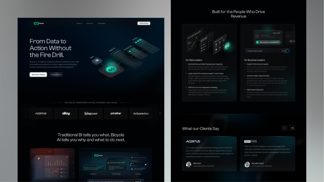
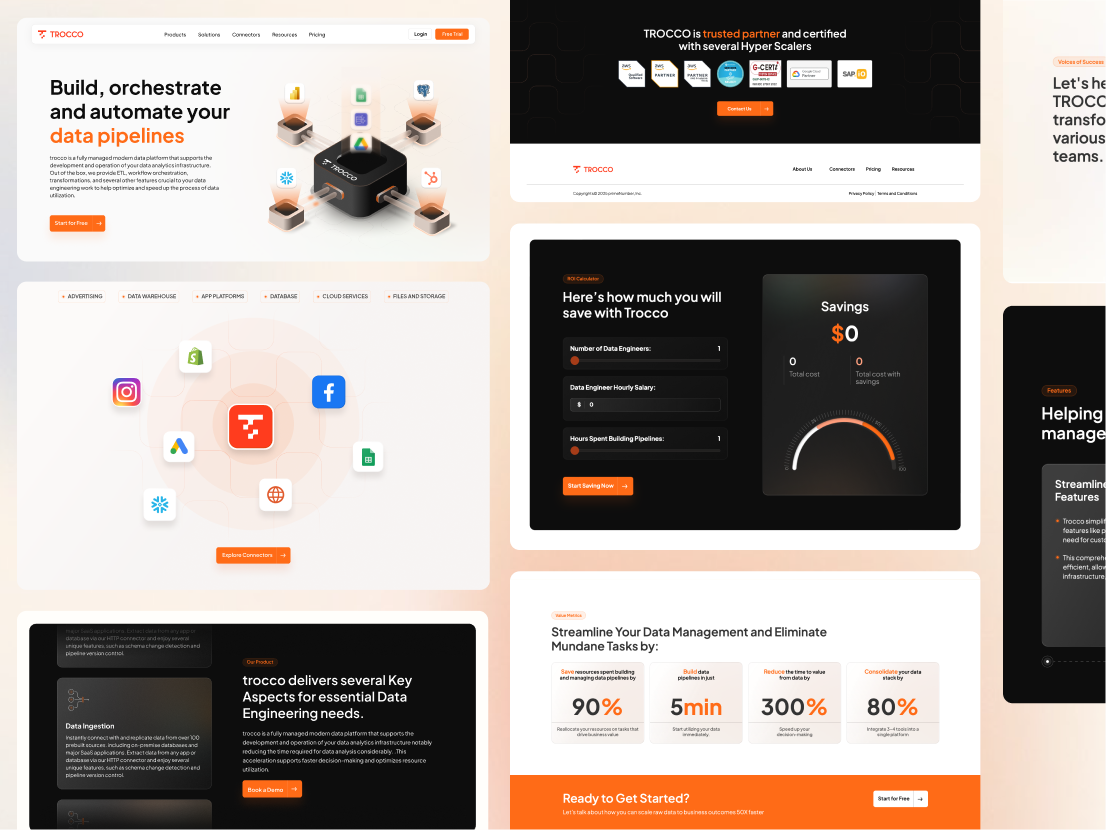
Your CTAs bridge the gap between interest and conversion. If they’re vague or hard to find, even engaged visitors won’t take the next step.
Use direct, action-oriented phrases like Book a Demo or Talk to an Expert. Make them visually distinct and position them strategically in your hero section, case studies, and pricing pages where intent is strongest.
Clarity and consistency in CTAs help guide visitors confidently through your funnel.
For example, for Trocco, we restructured CTAs to align with user intent across touchpoints. By placing clear, purpose-driven actions at key decision moments, we improved user flow and increased demo sign-ups.
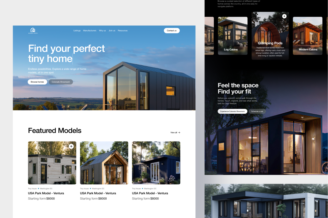
Generic stock photos make your brand feel impersonal. Handshakes, laptops, and posed office shots don’t build a connection; they blend you into the background.
Show real people, your culture and your products in action. If you use stock images, customize them to align with your brand’s tone and color palette. Better yet, invest in authentic photography or illustrations that reflect your identity.
Authentic visuals tell your story and help prospects remember you.
For ModelTown, we customized visuals to align with the brand’s tone and color palette, creating a unified look that felt genuine, memorable, and true to the brand’s identity.
Many websites jump straight into features and services without sharing the story behind the brand. Without context or emotion, your message feels transactional and people don’t connect with transactions.
Share why your company exists and how you help clients succeed. Frame your customers as the heroes and your brand as the guide. Use storytelling throughout your homepage, case studies, and About section.
A strong narrative helps prospects see themselves succeeding with you and that’s what drives action.
Explore our work for Singulr, where we built a storytelling framework that highlighted the brand’s purpose and positioned customers at the center, creating a stronger connection, engagement, and recall.
.png)
Get a free 10-minute Loom teardown of your homepage. We’ll walk you through what’s working, what’s holding you back and what to change (and why).
No sales pitch, no fluff. Just straightforward, actionable insights to help your site perform better.

The journey’s just as exciting as the destination. So, what are you waiting for? Let’s hit the gas.


.png)